Now that I have a website for finished work (
www.willgist.com), I'll be using this site in the future for sharing more of my workflow and thoughts when tackling new personal projects.
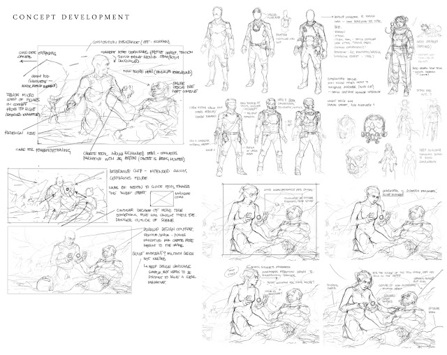
I'm working on another storyboard project at the moment which I will post wips for soon, in the meanwhile heres some design notes for some older stuff still in the works...
Need to start pushing specular highlights (compass in hand should pull slightly more focus, greatest contrast is centered currently around the goggles which is stunting flow) and differentiating materials - is presenting an interesting challenge with the lighting. (Note: materials such as the tire shoulder pad will read better when contrasted against metallic/fabric textures - define value structure)
I should pay closer attention to cooler temperatures in the shadows. Revise lighting on the background figures to break shapes - at the moment the scene reads largely as one flat silhouette.
Looking back, I seemed to overwork the initial concept to a weaker image for the painting below. This was however a good exercise for practicing more of how I want to approach developing narrative illustration. I went on to try to apply this process more concisely to the above piece.
As well as trying to vary and experiment more with my palette in future, I should also asses how I am dealing with value contrast and attempt some higher, lighter keyed images.


